

Smartphone, Tablets, and other mobile devices have become an integral part of our daily lives. With more people relying on smartphones and tablets for browsing, shopping, and accessing information, the importance of a mobile friendly website cannot be overstated. Recent studies show that mobile internet usage has surpassed desktop usage, making it crucial for businesses to adapt to this shift. A mobile friendly website not only enhances user experience but also boosts search engine rankings, increases engagement, and drives higher conversion rates. This blog aims to highlight the significance of having a mobile friendly website and offers practical tips to ensure your site meets the demands of modern users.
The Rise of Mobile Usage
Increasing Mobile Internet Usage
Global web traffic has significantly shifted towards mobile devices, with over half of all internet access now occurring on smartphones and tablets. In fact, according to Statista, during the fourth quarter of 2023, internet users worldwide spent 57.8 percent of their time browsing the internet via mobile phones. This shift is driven by the growing affordability and functionality of these devices.
Changes in Consumer Behavior
Mobile users expect seamless and efficient browsing experiences. Websites that are not optimized for mobile devices often experience higher bounce rates and lost business opportunities. The convenience of mobile access has also led to shorter attention spans, making quick-loading and user-friendly websites essential.
Impact on SEO
Search engines, particularly Google, have adapted to this shift with mobile-first indexing. This means that the mobile version of a website is considered the primary version for ranking purposes. As a result, having a mobile friendly website is crucial for maintaining good search engine rankings and ensuring visibility.
In addition to mobile-first indexing, staying abreast of current app development trends is crucial for maintaining a competitive edge. For instance, integrating AI-powered personalization into your mobile strategy can significantly enhance user engagement and satisfaction. To explore more on this and other emerging trends, consider reading the GoodFirms article on app development trends for 2025.
What is a Mobile Friendly Website?

Definition of a Mobile Friendly Website
A mobile friendly website is designed and optimized to function smoothly on mobile devices like smartphones and tablets. It ensures that the website’s layout, content, and functionalities are easily accessible and visually appealing on smaller screens.
Characteristics of a Mobile Friendly Website
- Responsive Design: This approach enables the website to automatically adjust its layout and elements according to the screen size of the device being used. A responsive design provides a consistent user experience across various devices.
- Fast Loading Times: Mobile users typically have less patience for slow-loading websites. A mobile friendly site is optimized for speed, ensuring quick access to content and reducing the likelihood of users leaving the site prematurely.
- Easy Navigation: Simplified navigation menus and touch-friendly buttons are essential for a mobile friendly website. Users should be able to find what they need without excessive scrolling or zooming.
- Readable Content: Text should be large enough to read without zooming, and paragraphs should be short and easy to scan. Clear headings and ample white space enhance readability.
- Mobile Friendly Media: Images and videos should be optimized for mobile devices, with appropriate sizes and formats that do not hinder loading times. Media should also be viewable without requiring additional plugins.
Differences Between Mobile Friendly, Mobile-Optimized, and Responsive Websites
- Mobile Friendly: A mobile-friendly website functions well on mobile devices but may not provide an optimal user experience. It maintains the same layout across all devices, which can sometimes lead to issues with usability on smaller screens.
- Mobile-Optimized: A mobile-optimized website is specifically designed for mobile devices, often featuring a separate version of the site tailored to the needs of mobile users. This approach can offer a better user experience but may require more maintenance.
- Responsive: A responsive website uses a flexible layout that adapts to the size of the user’s screen. This approach provides a consistent experience across all devices and is generally easier to maintain than having separate desktop and mobile versions.
Understanding these distinctions is crucial for businesses aiming to provide the best possible experience for their mobile users. A responsive design is often the preferred choice due to its adaptability and ease of maintenance.
Benefits of a Mobile Friendly Website

Improved User Experience
A mobile friendly website provides a seamless and enjoyable experience for users accessing the site on their smartphones or tablets. Features like easy navigation, readable content, and fast loading times ensure that visitors can find the information they need quickly and efficiently. This positive user experience can lead to increased time spent on the site and higher engagement rates.
Higher Search Engine Rankings
Search engines, particularly Google, prioritize mobile friendly websites in their search results. With the implementation of mobile-first indexing, the mobile version of a website is considered the primary version for ranking purposes. Having a mobile friendly site can improve your search engine rankings, making it easier for potential customers to find your business online.
Increased Engagement and Lower Bounce Rates
Mobile users are more likely to stay on a website that is easy to navigate and loads quickly. A mobile friendly site reduces the likelihood of visitors leaving due to frustration with usability issues. This leads to lower bounce rates and higher engagement, as users are more inclined to explore the content and services offered.
Greater Conversion Rates and Sales
A mobile-friendly website can directly impact your bottom line by increasing conversion rates and sales. When users have a positive experience on your site, they are more likely to complete desired actions such as making a purchase, filling out a contact form, or signing up for a newsletter. The convenience and accessibility of a mobile-friendly site can drive higher conversion rates.
Competitive Advantage
In a competitive market, having a mobile friendly website can set your business apart from competitors who have not yet optimized their sites for mobile users. A smooth and enjoyable mobile experience can enhance your brand’s reputation and attract more customers. Businesses that prioritize mobile optimization are better positioned to meet the demands of modern consumers and stay ahead of the competition.
Key Elements of a Mobile Friendly Website

Responsive Design Principles
Responsive design is the cornerstone of a mobile friendly website. It involves creating a flexible layout that automatically adjusts to fit the screen size of any device. Key aspects include:
- Fluid Grids: Using a grid-based layout with flexible columns that resize based on the screen size.
- Flexible Images and Media: Ensuring images and videos scale appropriately within their containing elements without distorting.
- CSS Media Queries: Applying different styling rules based on the device’s characteristics, such as width, height, and orientation.
- Mobile-First Approach: Designing for mobile devices first and then scaling up for larger screens. This approach ensures that the essential elements and functionality are optimized for mobile users from the start, providing a solid foundation for the entire design.
- Touch-Friendly Interactions: Designing elements to be easily accessible and usable with touch gestures. This includes larger buttons, adequate spacing between interactive elements, and incorporating swipe gestures where applicable. This enhances the user experience on touch devices by making interactions more intuitive and user-friendly.
Fast Loading Times and Performance Optimization
Speed is crucial for mobile users, who often have less patience for slow-loading sites. Key strategies for optimizing performance include:
- Minimizing HTTP Requests: Reducing the number of elements on a page to decrease load time.
- Compressing Images and Files: Using formats like JPEG and PNG for images and compressing CSS, JavaScript, and HTML files to reduce their size.
- Leveraging Browser Caching: Storing static files in the user’s browser to reduce load times on subsequent visits.
Simplified Navigation and Usability
Mobile friendly websites require intuitive navigation that’s easy to use on small screens. Key elements include:
- Hamburger Menus: Collapsible menus that save space and are easy to interact with using touch gestures.
- Large, Tappable Buttons: Buttons that are easy to tap without requiring precision, improving usability.
- Clear, Concise Menus: Simplified navigation structures that help users find what they need quickly.
Readable Content and Clear Call-to-Actions
Content must be easy to read and interact with on mobile devices. Important considerations include:
- Legible Fonts: Using font sizes that are large enough to read without zooming.
- Short Paragraphs and Headings: Breaking up content into short, digestible sections with clear headings.
- Prominent Call-to-Actions (CTAs): Placing CTAs in easily accessible locations and making them stand out visually.
Mobile Friendly Media
Ensuring that images, videos, and other media elements are optimized for mobile devices is essential. Key practices include:
- Adaptive Images: Using responsive images that adjust their size based on the screen resolution.
- Video Optimization: Embedding videos using formats and codecs that are compatible with mobile devices and ensuring they load quickly.
- Avoiding Flash: Using HTML5 for animations and interactive elements instead of Flash, which is not supported on many mobile devices.
By focusing on these key elements, businesses can create a mobile friendly website that provides an optimal user experience, improves search engine rankings, and drives higher engagement and conversions.
Best Practices for Mobile Optimization

Use Mobile-Friendly Themes and Templates
Choosing a theme or template that is designed with mobile users in mind is the first step toward mobile optimization. Many modern website builders and content management systems (CMS) offer a wide range of mobile friendly themes that are optimized for responsiveness and performance. These themes automatically adjust to different screen sizes and provide a consistent user experience across all devices.
Implement Accelerated Mobile Pages (AMP)
Accelerated Mobile Pages (AMP) is a framework developed by Google to help websites load faster on mobile devices. AMP strips down HTML and JavaScript to their essential elements, enabling pages to load quickly and efficiently. Implementing AMP can significantly improve your site’s loading times and enhance user experience, particularly for content-heavy websites like blogs and news sites.
Optimize Images and Videos for Faster Loading
Large media files can significantly slow down your website’s loading times. To optimize images and videos for mobile:
- Use Appropriate Formats: JPEG for photos, PNG for graphics with transparency, and MP4 for videos.
- Compress Files: Use tools like TinyPNG or ImageOptim to reduce file sizes without compromising quality.
- Implement Lazy Loading: Load media only when it becomes visible on the user’s screen, reducing initial load times.
Test the Website on Various Devices and Screen Sizes
Regular testing on multiple devices and screen sizes ensures that your website functions correctly across all platforms. Use tools like BrowserStack, Responsinator, and Google’s Mobile Friendly Test to simulate different environments and identify any issues. Testing helps you catch and fix problems before they impact your users.
Regular Updates and Maintenance for Continuous Improvement
Maintaining a mobile friendly website is an ongoing process. Regular updates and maintenance are crucial to ensure your site continues to perform well. This includes:
- Updating Software and Plugins: Keeping your CMS, themes, and plugins up to date to avoid security vulnerabilities and compatibility issues.
- Monitoring Performance: Using tools like Google Analytics to track mobile traffic and user behavior, identifying areas for improvement.
- Soliciting Feedback: Encouraging users to provide feedback on their mobile experience and using their input to make necessary adjustments.
By following these best practices, businesses can ensure their websites remain optimized for mobile users, providing a seamless and efficient experience that meets modern consumer expectations.
Tools and Resources for Testing Mobile Friendliness
Google’s PageSpeed Insights
Google’s PageSpeed Insights is a free tool that allows you to assess how well your website performs on mobile devices. Simply enter your URL, and the tool will analyze your site, providing detailed feedback on issues related to performance, responsiveness, and usability. It evaluates various aspects such as loading times, interactivity, and visual stability, offering suggestions for improvements. This tool is invaluable for identifying and addressing issues that may affect your site’s mobile user experience and search engine rankings.
Google Search Console for Mobile Usability
Google Search Console provides comprehensive insights into your website’s performance, including mobile usability reports. These reports highlight specific issues such as clickable elements being too close together, text being too small to read, and content wider than the screen. Regularly reviewing these reports helps ensure your site meets Google’s mobile usability standards.
Responsive Design Testing Tools
Several tools allow you to test how your website looks and functions across various devices and screen sizes:
- BrowserStack: A popular cross-browser testing tool that lets you test your website on real devices and browsers, ensuring compatibility and performance across different environments.
- Responsinator: A simple tool that shows how your website appears on common devices, helping you quickly identify and fix layout issues.
- Viewport Resizer: A browser extension that enables you to test responsive design directly within your browser, providing a convenient way to see how your site adapts to different screen sizes.
Analytics Tools to Monitor Mobile Traffic and Performance
Understanding how mobile users interact with your website is crucial for ongoing optimization. Analytics tools provide valuable data on user behavior and site performance:
- Google Analytics: Tracks mobile traffic, bounce rates, session duration, and other key metrics, helping you understand how mobile users engage with your site.
- Hotjar: Offers heatmaps and session recordings that show how mobile users navigate your site, revealing potential pain points and areas for improvement.
- Crazy Egg: Provides visual insights into user behavior with heatmaps, scrollmaps, and click reports, helping you optimize your mobile layout and content placement.
Mobile Optimization Plugins and Extensions
For websites built on popular CMS platforms like WordPress, there are numerous plugins and extensions designed to enhance mobile performance:
- WPtouch: A WordPress plugin that creates a simple, mobile friendly version of your site with customizable themes.
- AMP for WP: Adds Accelerated Mobile Pages (AMP) support to your WordPress site, improving loading times and mobile user experience.
- Smush: An image optimization plugin that compresses and resizes images, ensuring faster load times on mobile devices.
By utilizing these tools and resources, businesses can effectively test and optimize their websites for mobile users, ensuring a high-quality experience across all devices.
Case Studies and Examples of Mobile Friendly Websites
Case Study: eGEN
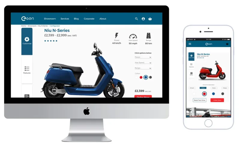 Company: eGEN https://egenscooters.com/
Challenge: eGEN, a company specializing in online applications for disability benefits, recognized the need to optimize their website for mobile users. They aimed to improve accessibility and user experience across various devices, ensuring a seamless and efficient process for their users.
Solution: eGEN implemented a comprehensive responsive web design (RWD) strategy. The key strategies included:
- Fluid Grid Layouts: Ensuring that the website layout adjusted smoothly across different screen sizes.
- Flexible Images and Media: Implementing scalable images and media to maintain visual integrity on various devices.
- CSS Media Queries: Utilizing media queries to apply specific styles based on device characteristics like screen width and orientation.
Additionally, eGEN focused on optimizing performance to ensure fast loading times and smooth interactions, critical for users seeking quick and reliable access to their services.
Results:
- Improved Accessibility: The responsive design made it easier for users to navigate the site on mobile devices, increasing overall accessibility.
- Enhanced User Experience: Users experienced a seamless transition across devices, leading to higher satisfaction and engagement.
- Increased Conversions: The improved user experience contributed to a higher conversion rate, as more users completed their applications without issues.
By prioritizing responsive web design, eGEN successfully enhanced its website’s performance, accessibility, and user experience, demonstrating the significant impact of mobile optimization on business outcomes.
For more details on eGEN’s responsive web design journey, you can read the full case study.
Case Study: Lagos Tourism Campaign
 Company: Lagos Tourism Campaign
Challenge: The campaign aimed to promote tourism in Lagos, Nigeria, targeting the Nigerian diaspora’s younger generation. The goal was to reconnect them with their heritage through music festivals and cultural experiences, requiring a strong visual brand identity and a responsive website.
Solution: The project involved creating a responsive web design and consistent branding strategy. Key steps included:
- UX Research: Understanding the target audience and defining user personas.
- Visual Identity: Using Lagos-specific monuments for inspiration, creating a logo incorporating cultural symbols, and selecting Pan-African colors.
- Responsive Design: Developing both desktop and mobile versions with a focus on usability and visual appeal.
- User Testing: Conducting tests with potential users to refine the design and ensure it resonated with both male and female audiences.
Results:
- Increased Engagement: The responsive website provided an engaging and impactful user experience, connecting the target audience with their heritage.
- Consistent Branding: A cohesive visual identity across all marketing materials, including merchandise, social media, and promotional items.
- Positive Feedback: User testing confirmed the design effectively resonated with the target audience, meeting the campaign’s goals.
For more details on the Lagos Tourism Campaign’s responsive web design and branding journey, you can read the full case study.
The Imperative of Mobile Optimization: Key Takeaways and Next Steps
In today’s digital landscape, having a mobile friendly website is no longer optional—it’s essential. The rise of mobile internet usage and changing consumer behavior underscore the need for businesses to prioritize mobile optimization. As demonstrated by the real-world examples of eGEN and Lagos Tourism Campaign, a mobile friendly website can significantly enhance user experience, increase engagement, and drive business growth.
Key Takeaways:
- Improved User Experience: A mobile friendly website ensures a seamless and enjoyable experience for users on their smartphones and tablets. Features like easy navigation, readable content, and fast loading times are critical.
- Higher Search Engine Rankings: Mobile optimization is a crucial factor in search engine rankings. With mobile-first indexing, search engines like Google prioritize mobile-friendly websites, making it easier for potential customers to find your business online.
- Increased Engagement and Conversions: A well-optimized mobile site reduces bounce rates and encourages users to stay longer and engage more with your content. This can lead to higher conversion rates and increased sales.
- Competitive Advantage: In a competitive market, having a mobile friendly website can set your business apart from competitors who have not yet optimized their sites for mobile users. It enhances your brand’s reputation and attracts more customers.
By following best practices for mobile optimization, utilizing tools and resources to test and refine your site, and learning from successful case studies, businesses can ensure their websites meet the demands of modern consumers. Prioritizing a mobile-friendly design is a strategic move that can lead to long-term success in the digital age.
Ready to Optimize Your Website for Mobile Success?
Is your website meeting the needs of today’s mobile users? Don’t miss out on potential customers due to a subpar mobile experience. Our team of website experts specialize in creating mobile-friendly websites that are not only visually appealing but also optimized for performance, user engagement, and higher search engine rankings. Transform your website into a mobile friendly powerhouse with our website design services!

About the Author
Jason Holicky is the founder of Holicky Corporation, a successful marketing agency in New Lenox, Illinois. With over 25 years of experience, he specializes in marketing consulting, website development, corporate photography, video editing, and social media management. Jason is passionate about helping businesses thrive and staying updated with marketing and technology trends. He is a certified Google Ads expert and AppDirect technology advisor.
Related Posts


Ready to Elevate Your Online Presence? Let’s Get Started!
Take the first step towards a robust online website system with our expert web development services. Whether you’re looking to create a custom website, build a scalable Content Management System, or develop seamless APIs, our team is here to bring your vision to life. Contact us today to discuss your project and discover how our custom solutions can transform your online platform.